When presented with the task of creating a response to the experiences people have when engaging in discussion online, a group of three other designers and myself spent a month and a half researching, designing, prototyping, and branding an application that would help iron out potential wrinkles in online conversation. We began by interviewing a variety of subjects, and making observations based on our notes and interactions during those interviews. Questions ranged from how frequently they used social media to asking for detailed walkthroughs of their thought processes before and after posting content. This research resulted in 80-100 different observations collected from around 20 different interviewees of a variety of genders, ethnicities, ages, and education levels, which we used to futher develop our reseearch.
After sorting through and rereading each of our observations, we began to notice recurring themes in all of the responses we got, and began recording them and organizing them according to certain categories they related to, like "reasons for using social media" or "fears and reservations about social media". This helped us visualize which areas gave our team the most opportunities for intervention. As we continued, we were able to narrow down our focus to a few key insights that gave everything we created far more direction than we might have had otherwise. This led to the development of five different personas, people through which we could test, reference, and analyze our work throughout the process. With the brunt of the research completed, we moved on to the development of our product.
We decided that based on the concerns most users had, it would be helpful to develop a tool that could help keep technology users aware of what they plan to say before they send their messages or submit posts. There were a variety of different ways to apply this concept, but we thought that one of the most friction-less would be to simply point out when certain words or phrases might cause offense. We definitely wanted to avoid turning things into a form of censorship, because it would would be both offputting to potential users and not address part of the problem: increasing users' self-awareness, and allowing them to choose how they want to present themselves.
After this process, we applied brand elements that I and one other group member collaborated on. We chose a deep purplish-blue to mimic the blue that is commonly used among social media platforms and help things feel compatible with the apps users are already engaging with. We picked a typeface that was high contrast, and would stand out from the typical geometric sans-serifs that many digital communication tools use. The higher x-height, heavier weight, and condensed nature of the typeface all allowed it to be used as a way to highlight which words users should think about before using. In addition to changing the typeface of certain words, we thought it necessary to add 'brackets' to each word or phrase to increase the contrast from the rest of the users' text even more, leading to a more developed brand with a handful of different working parts.
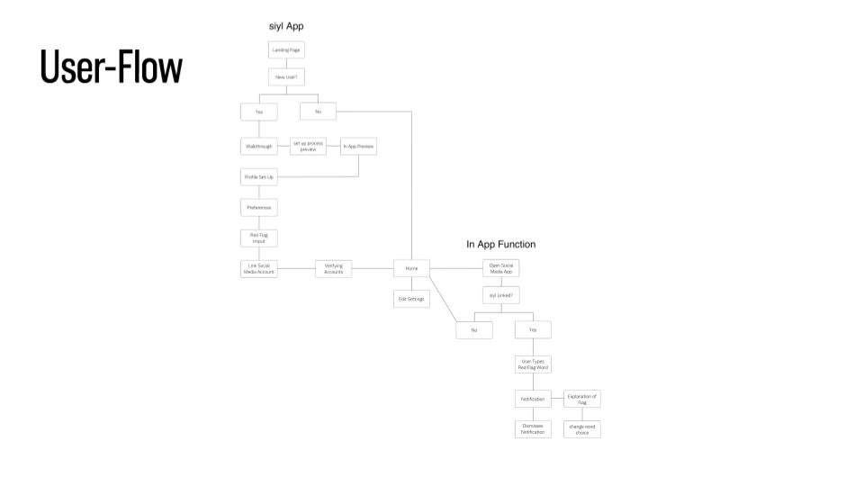
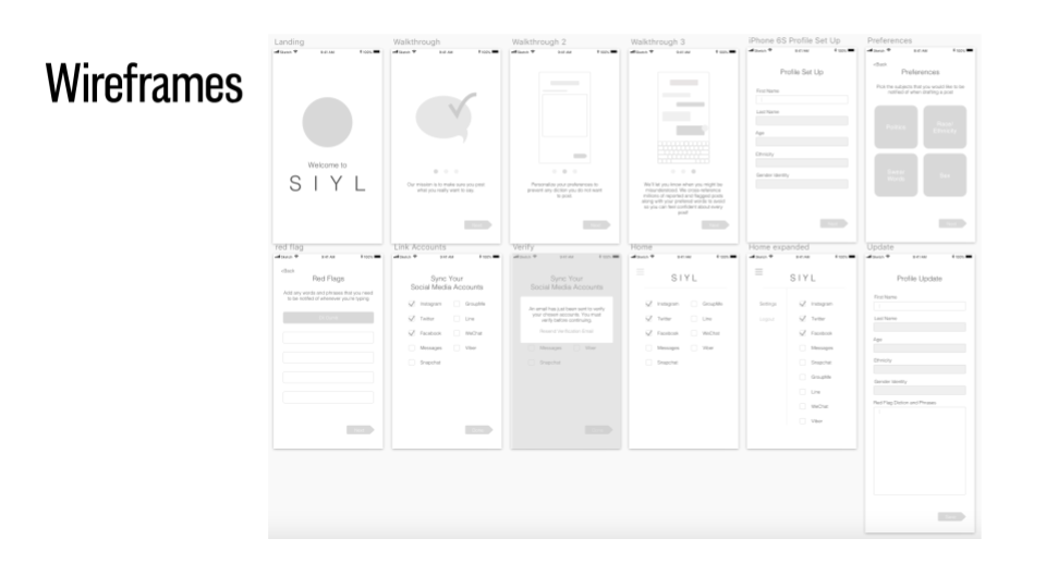
As a team, we completed wireframes and mapped out the flow of users through or application. This part of the project was, after the research, the most time consuming, and allowed us to make sure that every page, screen, or menu the users visited was helping to do its job. Finally, we put together short clips to help visualize what the animations in the application might look like, showing how users are notified of sensitive words and phrases and what they can do after.